FontFind allows designers to scan any text and instantly identify the typeface. In Addition to scanning, users can build a personal library and use AI-driven font pairings to find the perfect typographic combinations for their next project.
Context
Designers often discover type on posters or prints and want to see which typeface the respective poster, flyer or ad uses. But existing tools to identify typefaces feel clunky and overcompliated.
To change that, my strategy was to first build in a solid structural foundation, then progressively go into the little design & interaction details as well as align the interface with Apple’s Human Interface Guidelines and the new Liquid Glass Design System.
Key Design Decisions
A Solid foundation through wireframes.
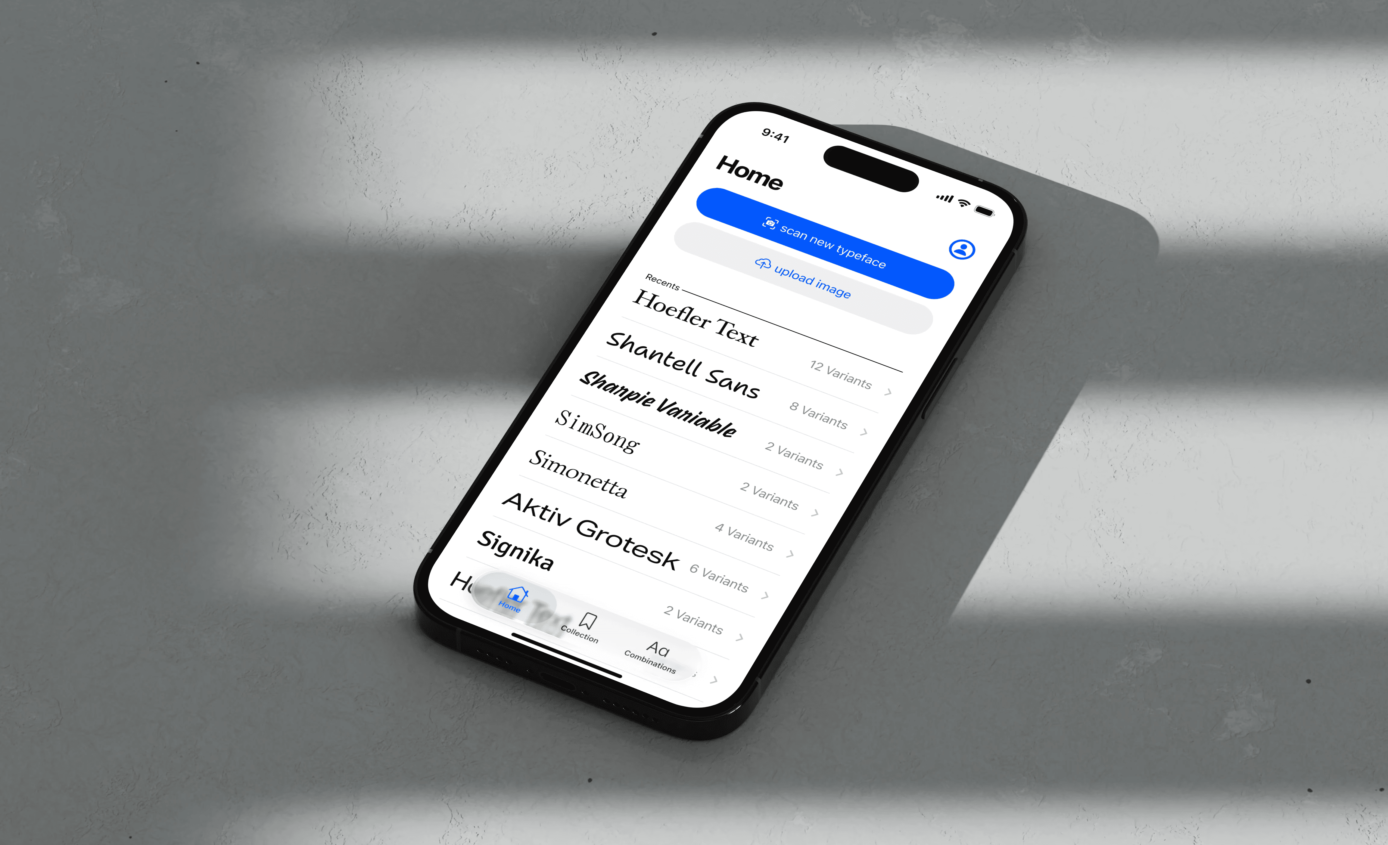
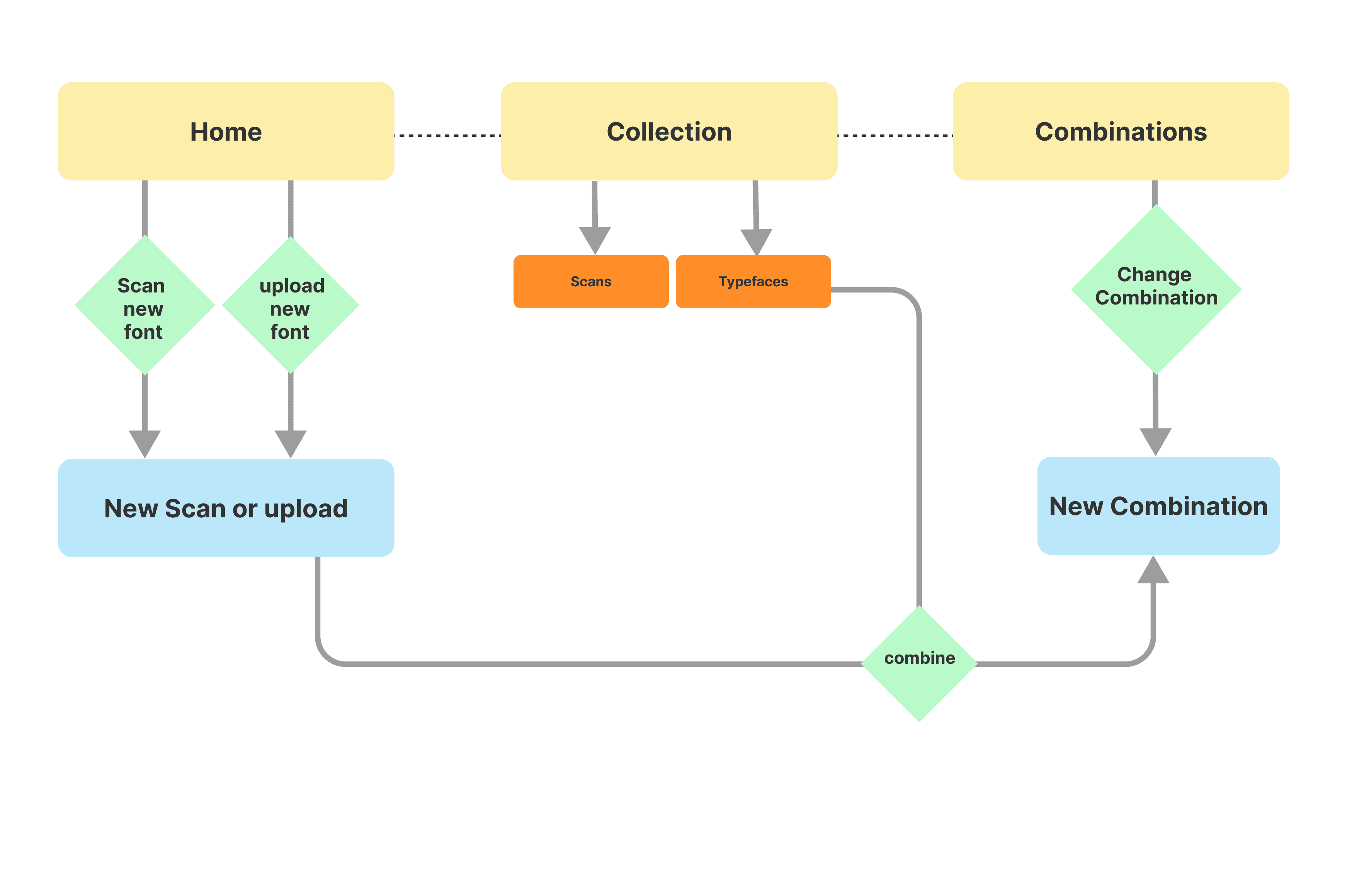
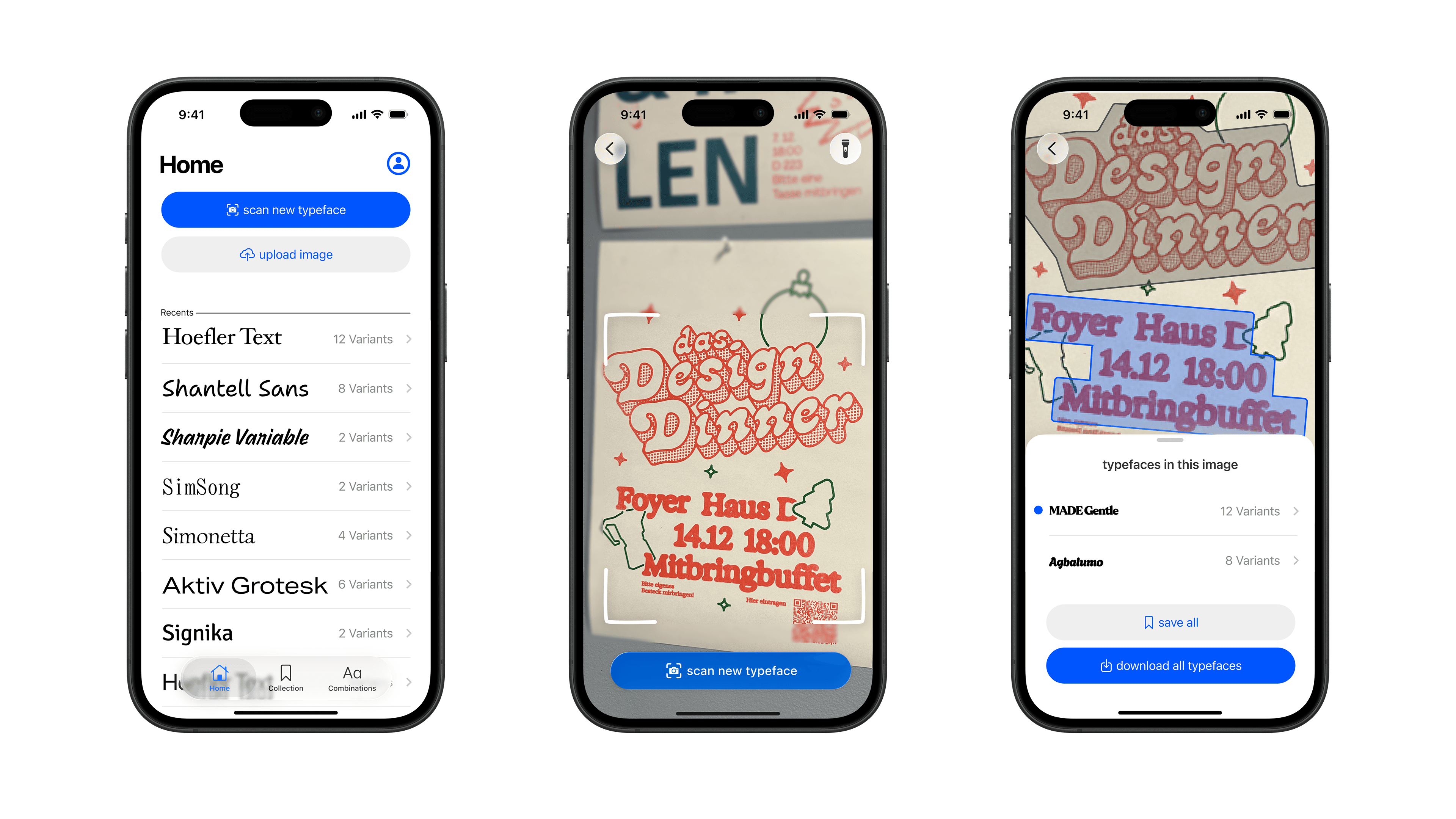
I started with low‑fidelity wireframes focused on structure and information hierarchy. What features are necessary? and how should they be aligned and structured? For example, in the scanner, I prioritized easy to reach controls so users always know what the camera is “looking at.”
Embracing the little details
With the structure in place, I overhauled the interface and for example added…
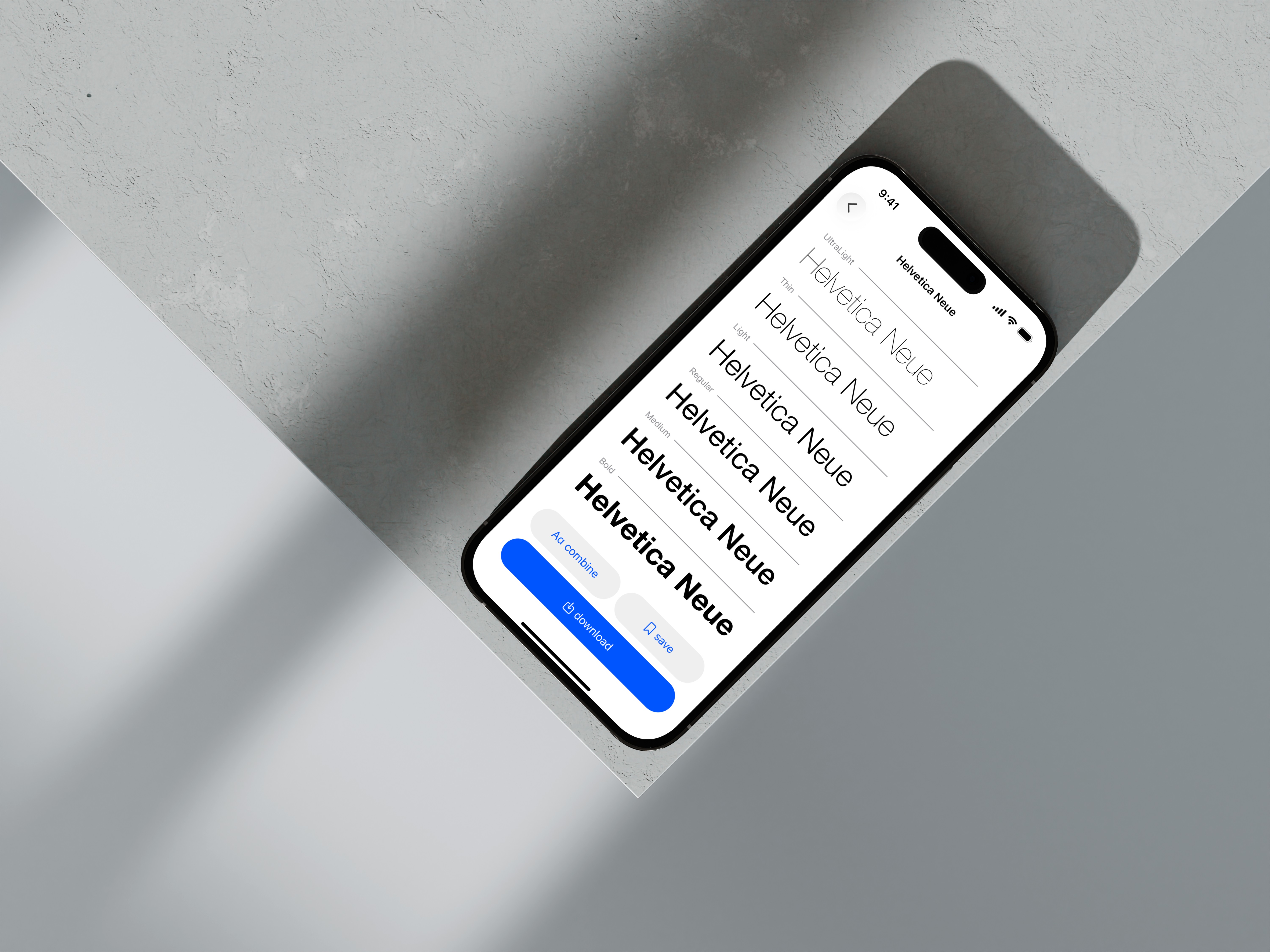
I swapped custom list, menu and button layouts for official Apple Liquid Glass components , making interaction patterns instantly recogniszable for the users.
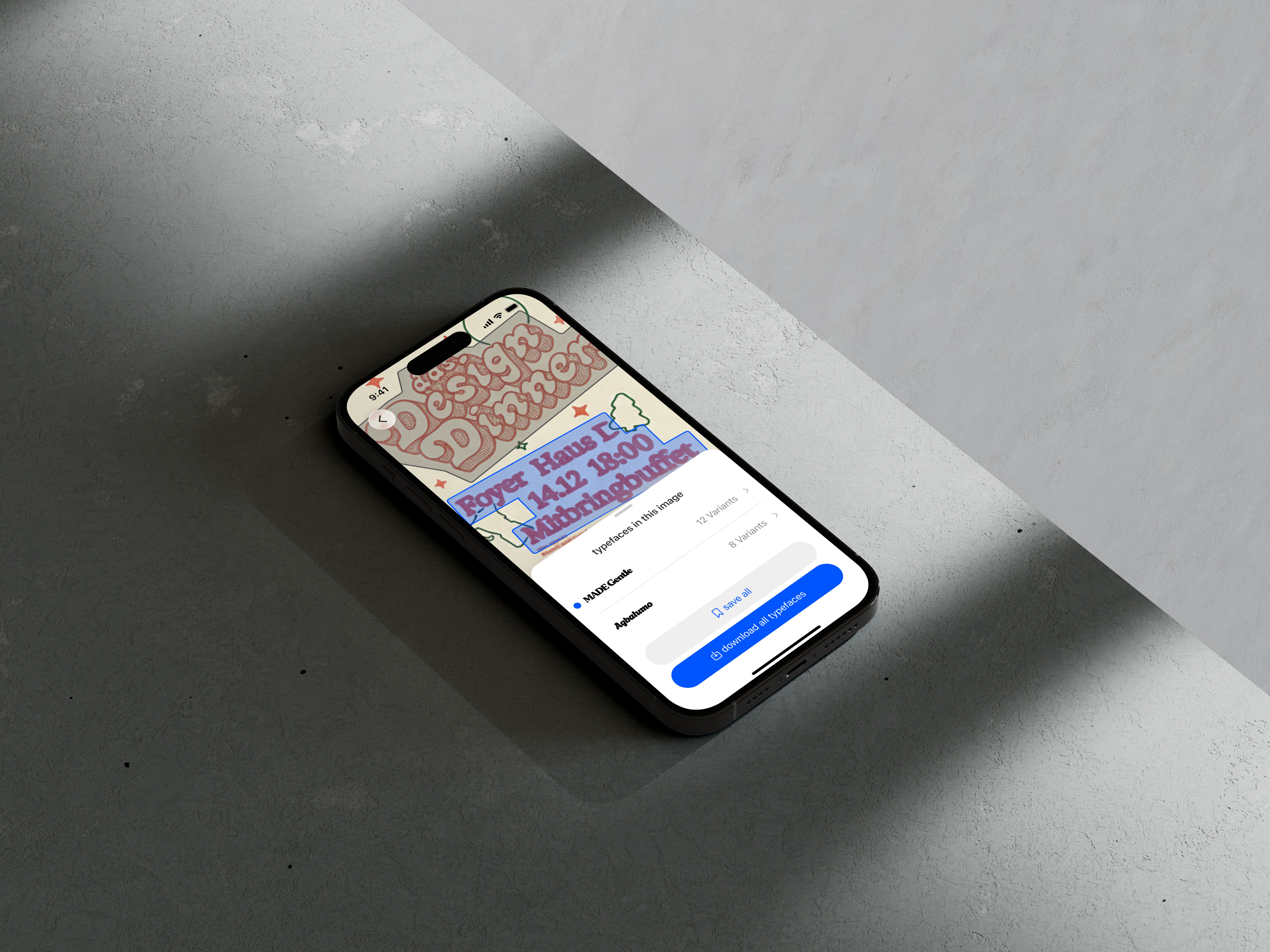
The scanning interface gained clearer markers and highlighted regions, so users can see exactly which type areas are being detected in real time.
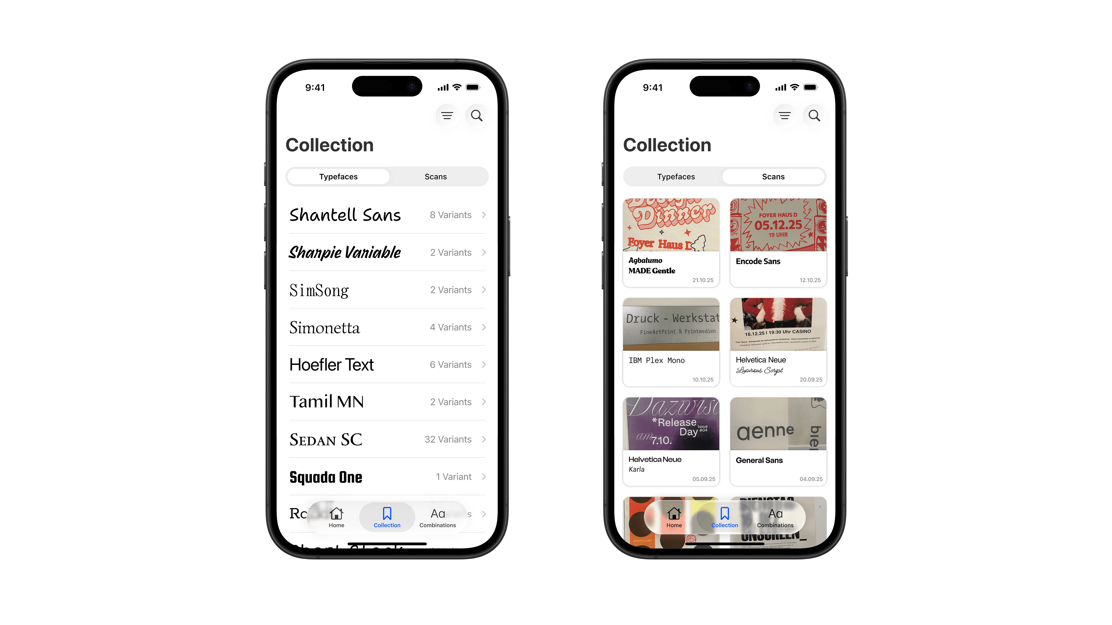
In the collection, I separated the mental models of “typefaces” and “scans,” with a segmented control making it obvious whether you’re browsing your actual fonts or the images you captured.
Testing & User Feedback
Between my iterations i talked to a fellow designers ans asked them for their feedback. These Insights pushed my design to the limits.
I could undertand if my design decison and mental models were working.
I got a lot of ideas for features i didnt even think of myself previously.
Outcome
For designers, Font Find now feels less like a standalone tool and more like an extension of iOS: easy to use in fast, real‑world moments.
Reflection & Learnings
Designing inside a strict design system is not a creative constraint but actually helps to build an product for trust and speed.
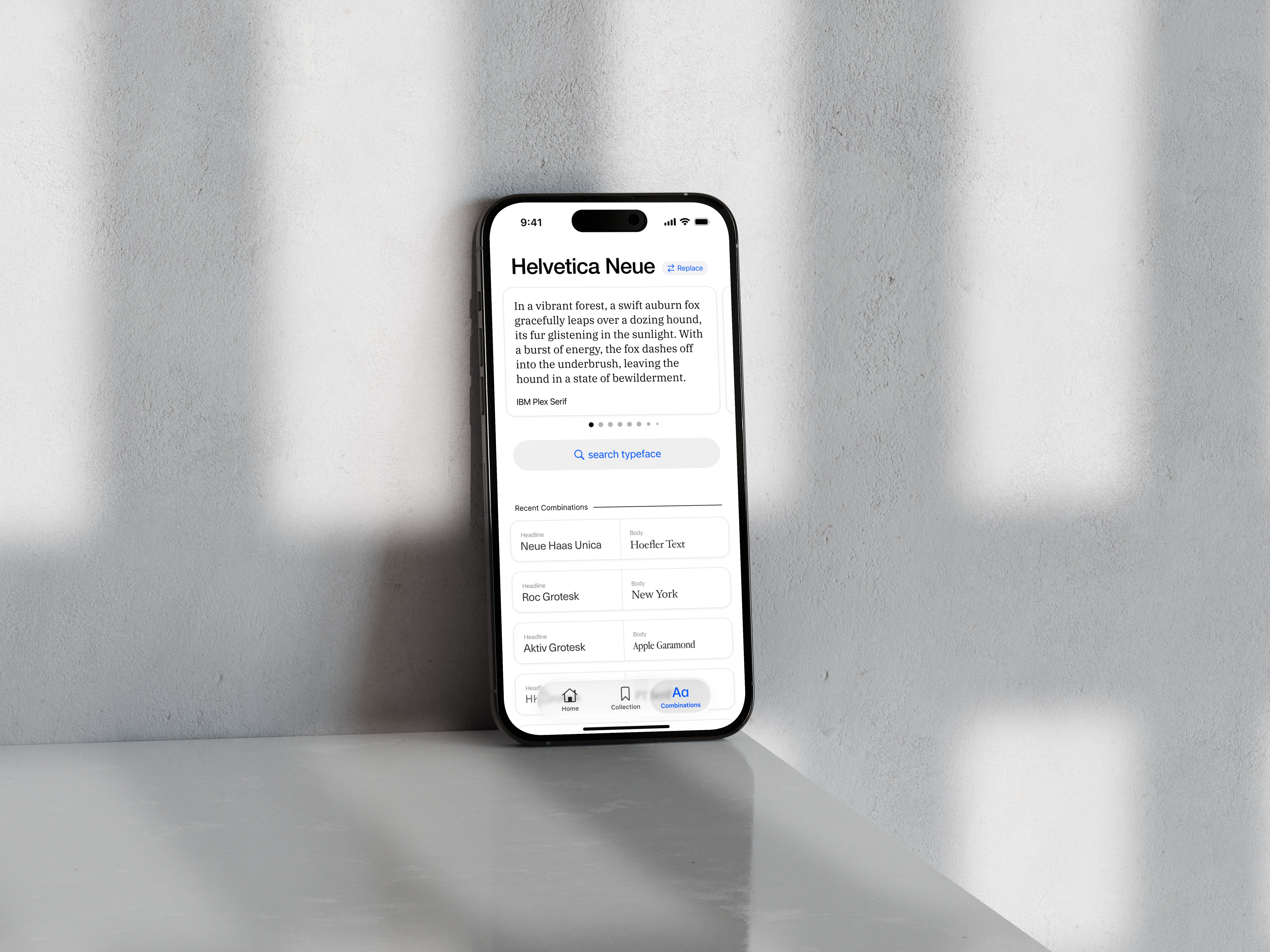
Native components and familiar patterns reduce onboarding time and free cognitive space for the actual task—discovering and combining type.
App Design, UI Design, Figma
Paul Dobrić